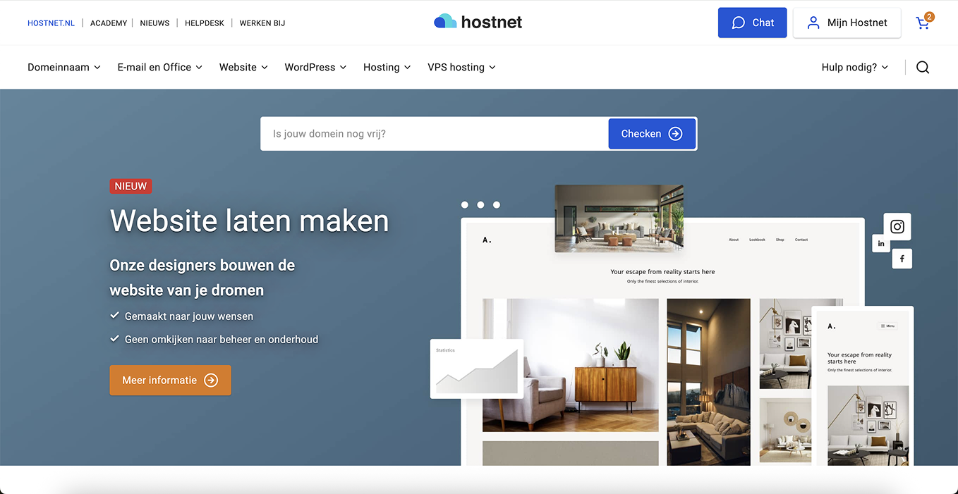
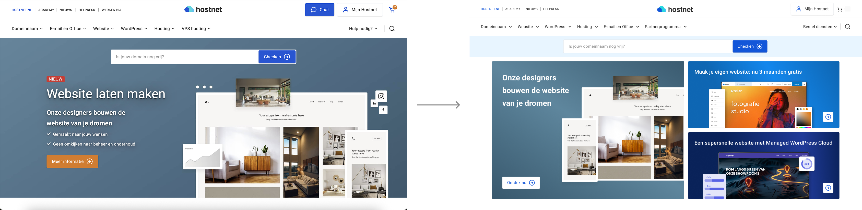
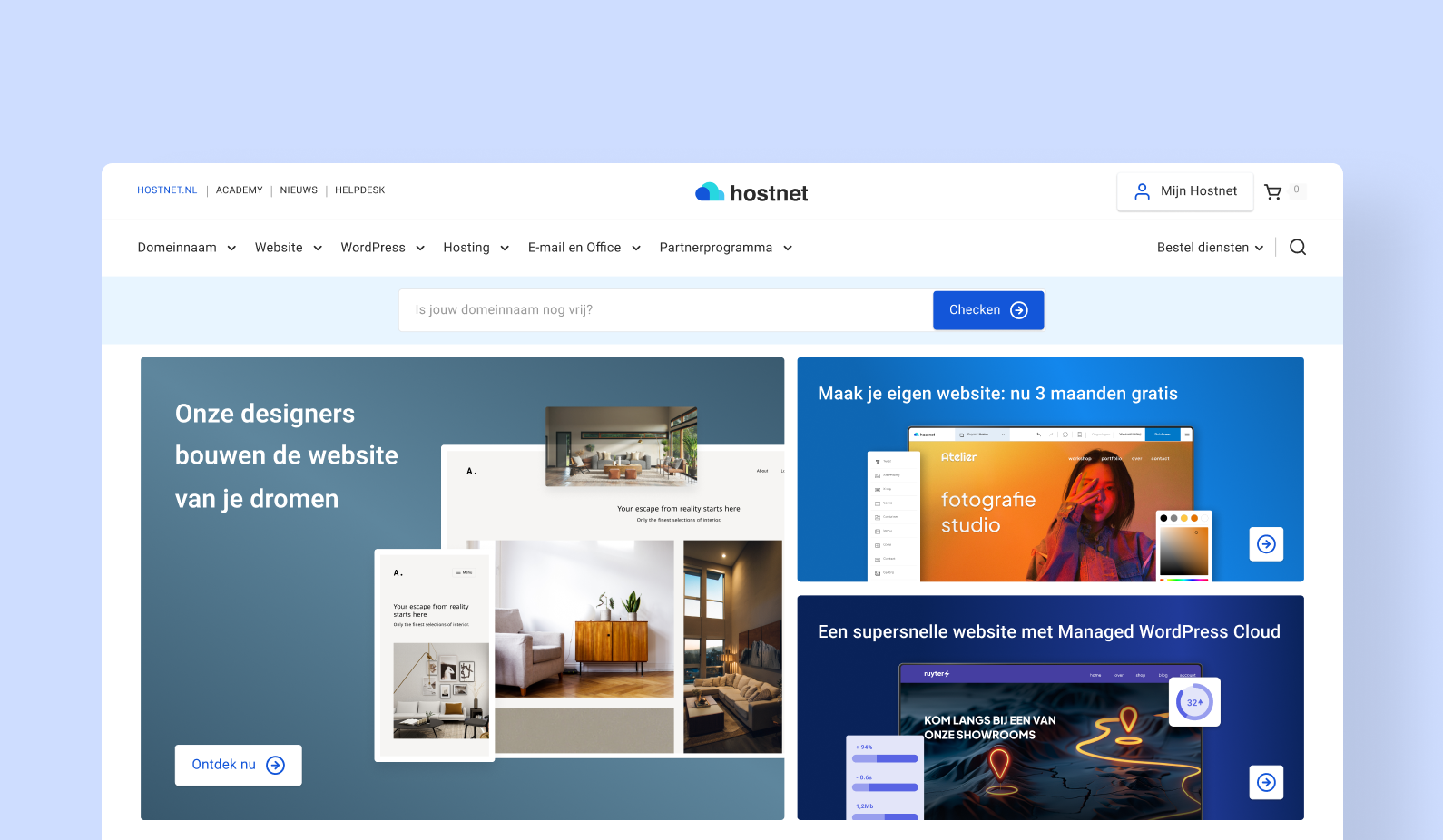
Homepage hero-section

A redesigned homepage hero section for Hostnet.nl that boosts user engagement by clearly showcasing key products and tasks, resulting in a 138.7% uplift in click-through rate.
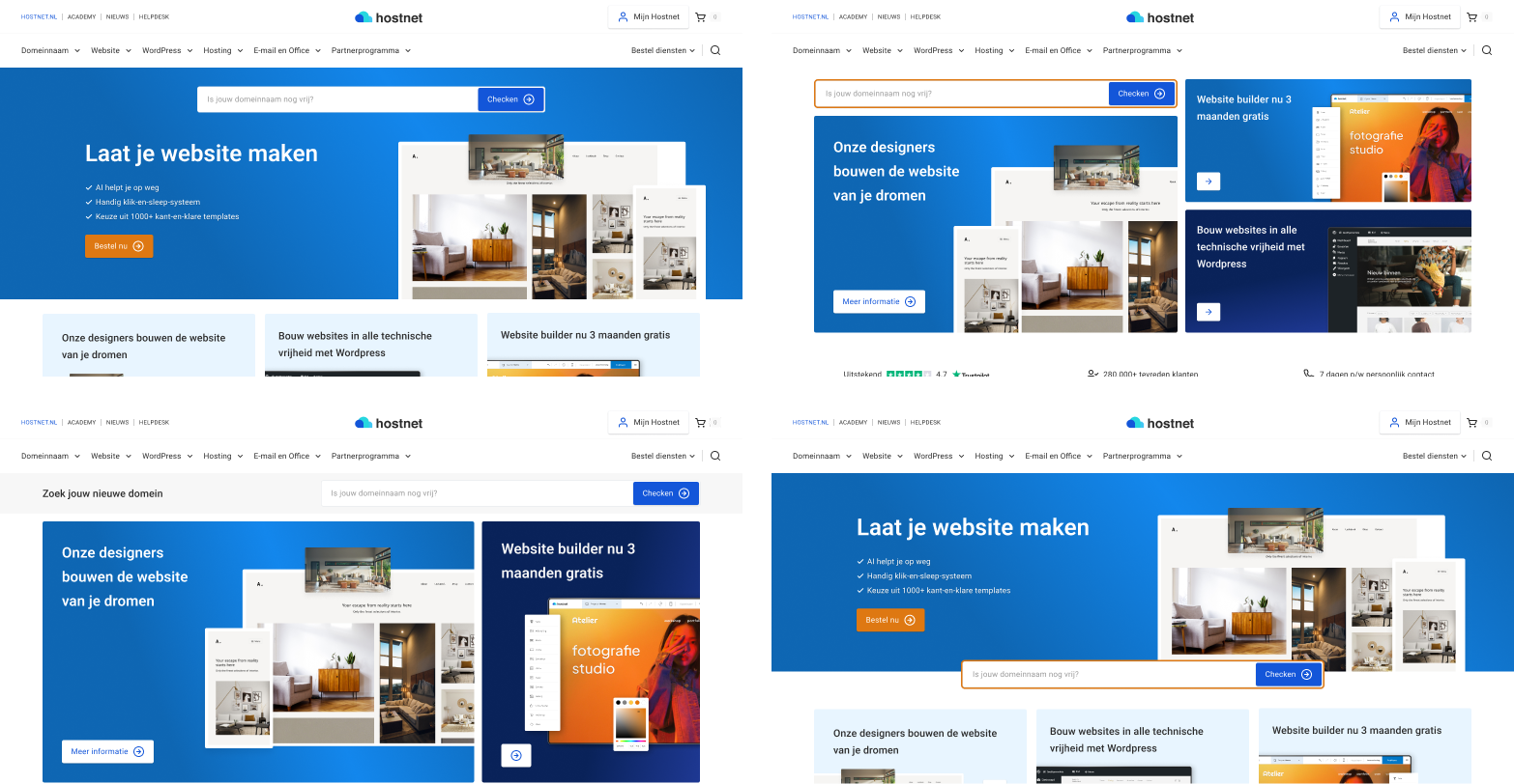
Problem

The homepage attracted traffic but lacked clear guidance, causing most users to primarily log in without exploring other key products or services, limiting overall engagement and conversion opportunities.
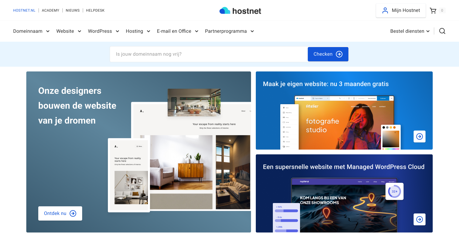
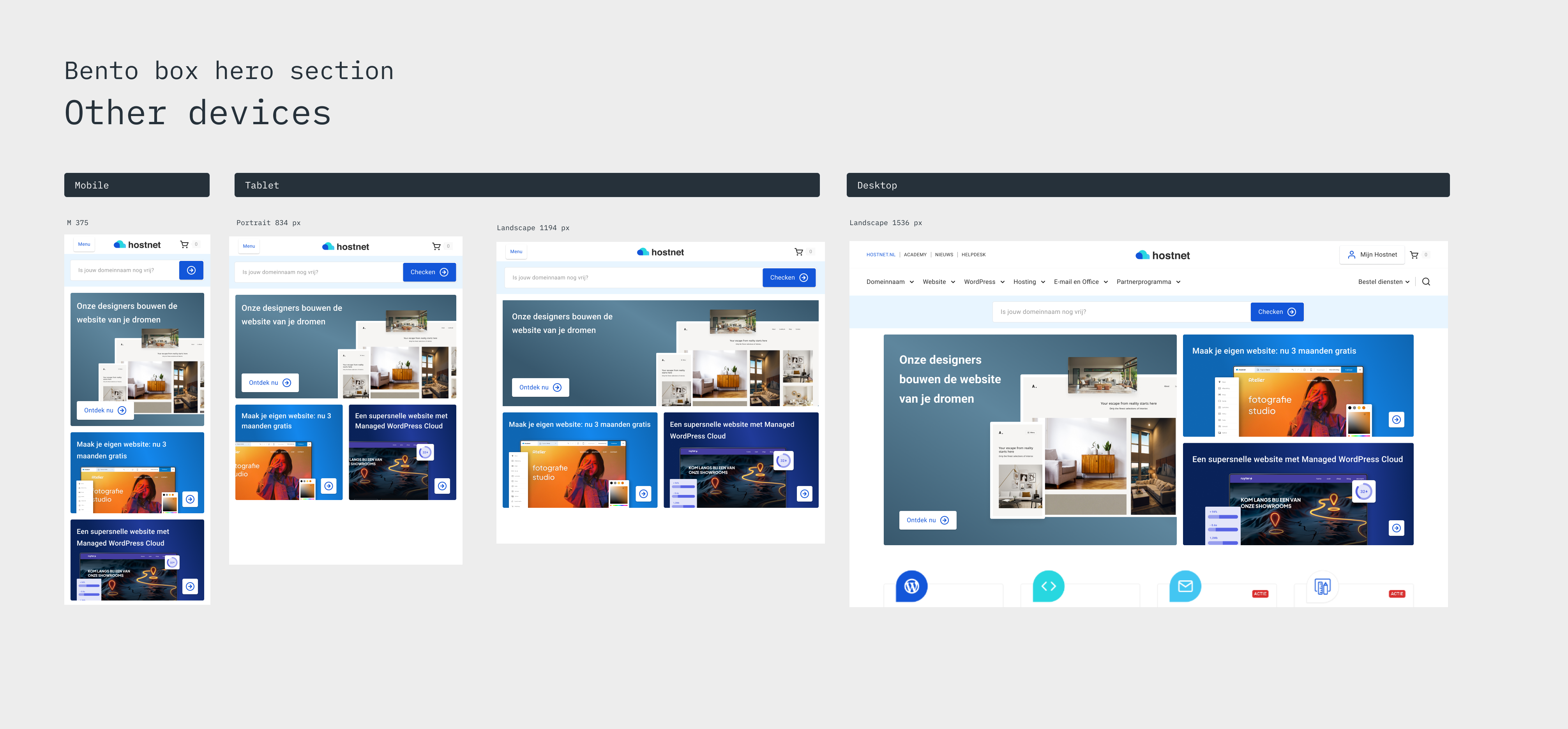
Solution

The new layout shows important services above the fold, making it easier for users to find and engage with them. This change led to much higher interaction and helped users explore beyond logging in.

Design Challenge

How can we help users quickly understand what they can do on the homepage and easily find the products they need?

Context

The homepage of Hostnet is one of the most visited pages across the platform. While it sees steady traffic, engagement levels were not fully aligned with its potential. Many visitors used it primarily as an access point to log into the control panel, with limited interaction beyond that. This presented an opportunity to explore how the homepage could play a more active role in supporting user goals and showcasing the broader value Hostnet offers.

Ideation and trying different lay-outs

After reviewing the homepage’s engagement challenges, I explored current design trends to find effective solutions. One approach that stood out was the bento box layout which breaks content into clear, organized sections. This style is popular and helps present multiple products in a simple, accessible way.

I integrated this bento-style layout into Hostnet’s homepage to highlight key services like having a website build, website builder and Managed Wordpress Hosting.  This makes it easier for users to find what they need quickly without feeling overwhelmed. To verify that the redesign improved user experience, we set up an A/B test in VWO. This allowed us to compare the original homepage with the new design and measure real impact on engagement and conversions. Using data-driven testing ensured the changes were effective before full implementation.

End result

The final design introduces a clean and organized hero section that clearly presents Hostnet’s core services right at the top of the homepage. By using a bento-style layout, each product and user task is given its own space, making it easy for visitors to quickly understand their options and take action.

Outcomes and Metrics

The A/B test showed a significant improvement. The redesigned hero section achieved a 138.7% increase in click-through rate compared to the original version. This confirmed that the clearer layout and more visible product offerings made it easier for users to engage with the page.In the visual comparison, the original homepage (on the left) centers on login, offering little beyond that. The new version (on the right) introduces a grid-style layout that highlights multiple services, helping users find relevant next steps immediately upon landing.